method men feel the fresh campaign
We had the opportunity to work on the first in-house creative campaign for method men. This was a great opportunity to work cross-functionally and make some fresh new content. This content helped solidify our brand presence digitally, and drove traffic to the method men DTC site.
my role: concept, creative direction, execution
creative team: Jennifer Bhalla, Lindsay Corso, David Fullarton
Production: The Cabinet
[WARNING: MORE GOOD STUFF AS YOU SCROLL DOWN]
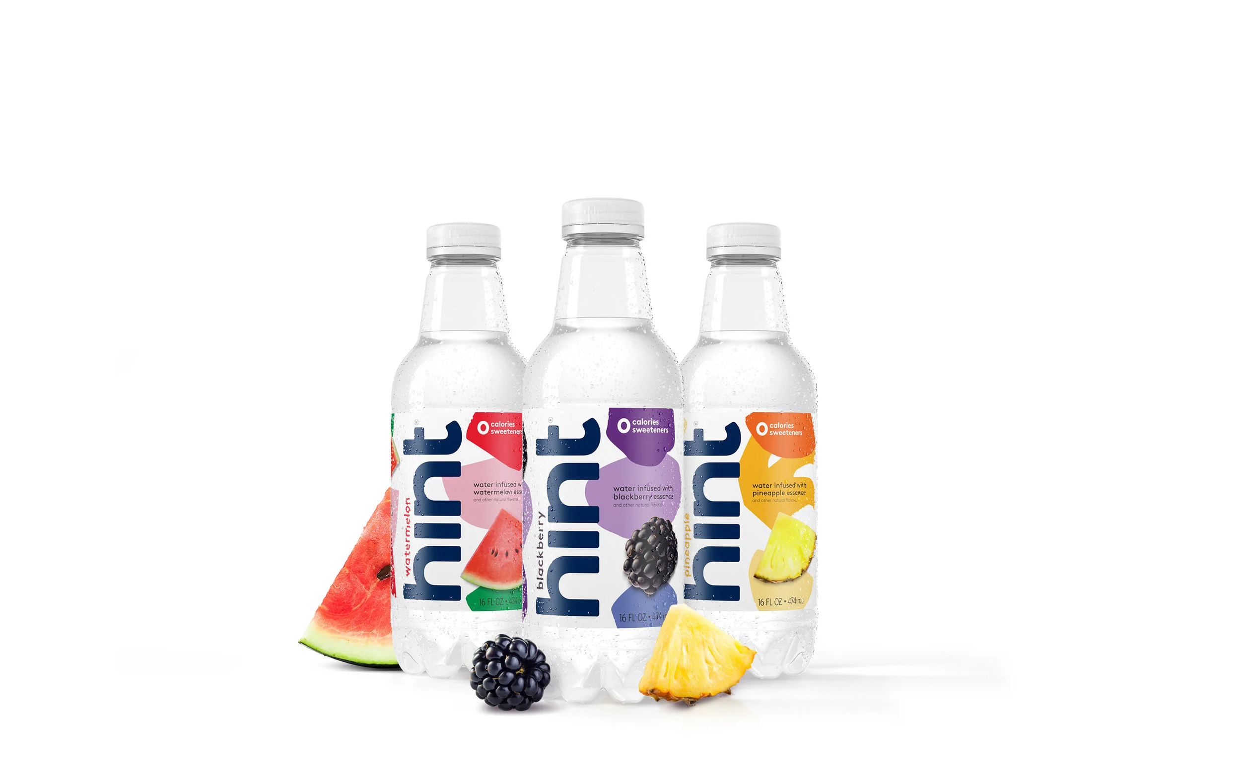
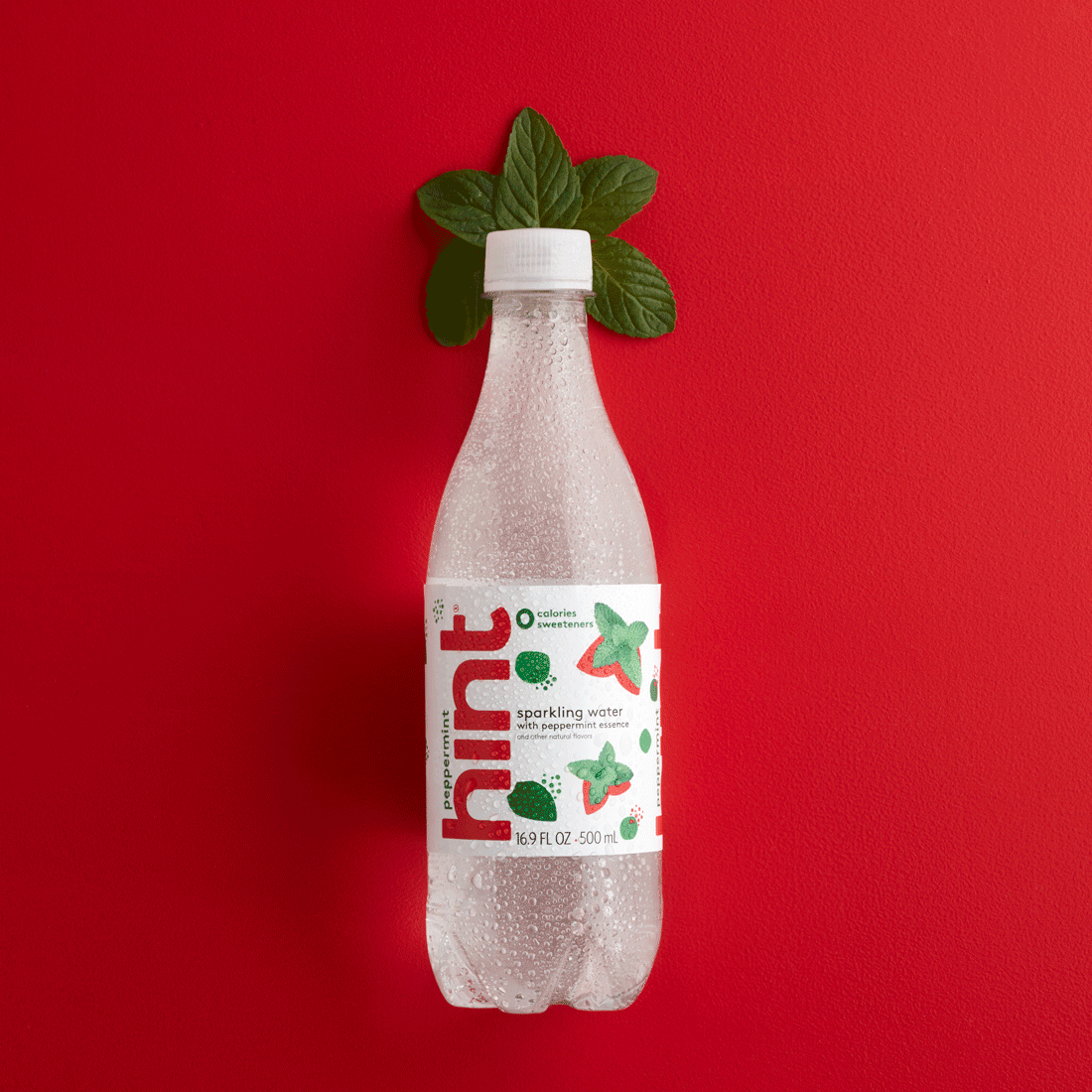
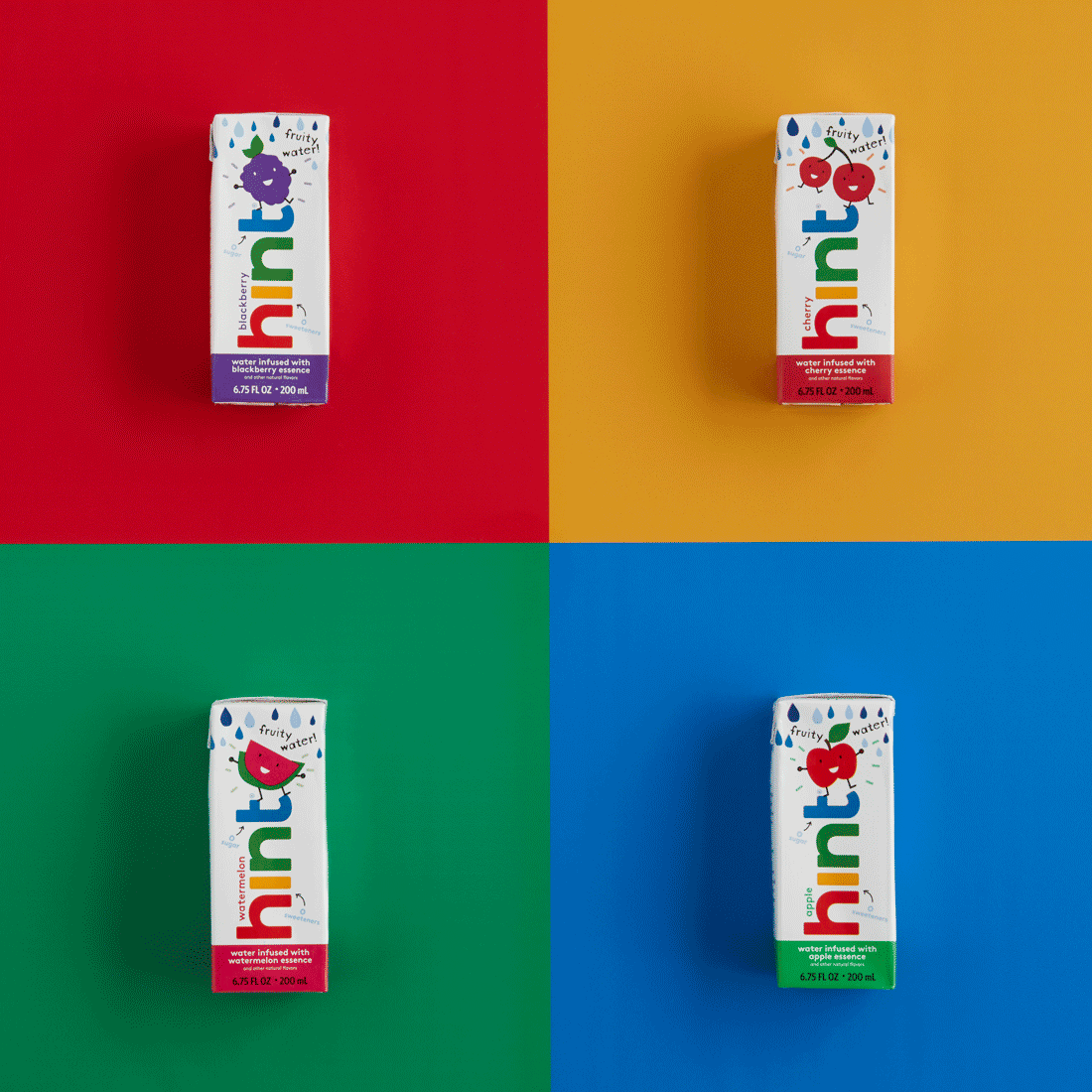
I had the opportunity to work with a great branding and design agency called Mrs. and Mr. to concept, provide creative direction, and feedback for the rebrand as a whole. I then worked with the hint design team to execute the design on the packaging for all flavors of labels and shrinks. What you are seeing is the end result.
Agency: Mrs. & Mr.
Creative Director: Katrina Firenze
Design Team: Casey Green, Benny Rapp
Project Manager: Sophia Rossi
[WARNING: MORE GOOD STUFF AS YOU SCROLL DOWN]
This was such a fun project. I got to design hint® water’s first retail store. This would serve as not only a place to buy product, but a place to learn and live the brand. In interactive experience, totally instagram-able in every corner. From the I heart hint bottle mural, to the adult swing, to the transparent color coded windows, this was a symbol of hint’s new branding.
Creative Director: Katrina Firenze
Produced by: Eye Heart SF
[WARNING: MORE GOOD STUFF AS YOU SCROLL DOWN]
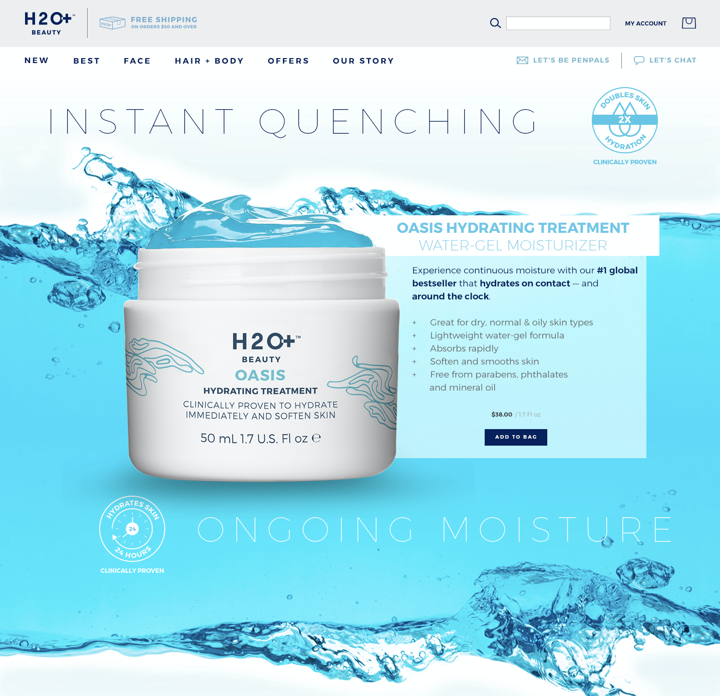
In deciding to move onto the Shopify platform, we worked with BVAccel to update the functionality and look and feel to correspond with the rebrand as a whole. I provided creative direction, design and feedback for the site as a whole. I then worked with the hint design team to execute the design on the email templates and all other assets to make for a cohesive look and feel.
www.drinkhint.com
Agency: BVAccel
Creative Director: Katrina Firenze
Designer: Casey Green
Project Manager: Sophia Rossi
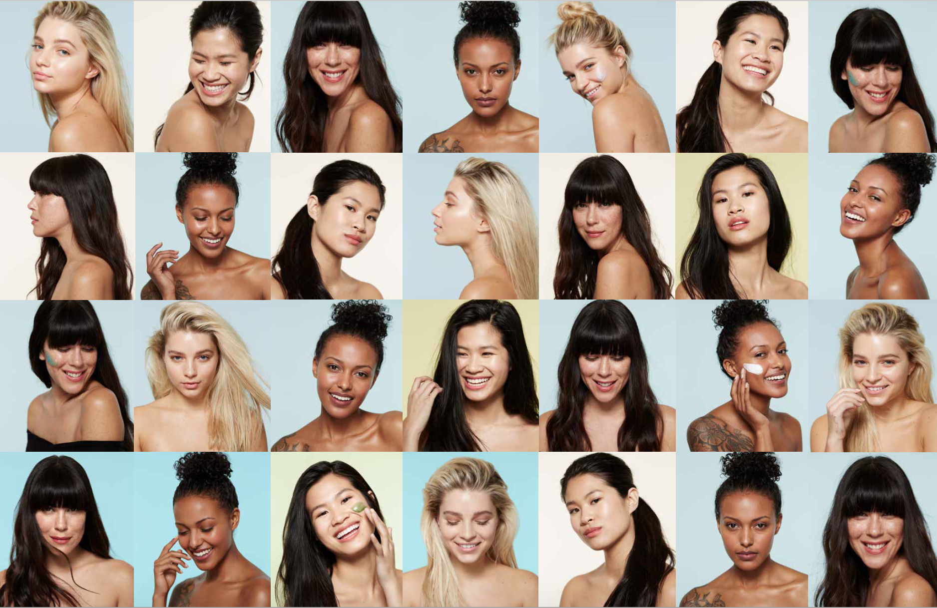
Photoshoot for the rebrand campaign launch. I lead the concept, creative direction, and execution of the photography. It was such a fun shoot with super talented photographer Chris Andre.
Creative Director: Katrina Firenze
Photographer: Chris Andrea
Wardrobe: Janis Bakken
Hair & Makeup: Jen Toy
Photoshoot for the rebrand campaign launch. I lead the concept, creative direction, and execution of the photography. It was such a fun shoot with super talented photographer Chris Andre.
Creative Director: Katrina Firenze
Photographer: Chris Andrea
Wardrobe: Janis Bakken
Hair & Makeup: Jen Toy
For this shoot I was responsible for art and creative direction from concept through execution.
Photographer: Chris Andre
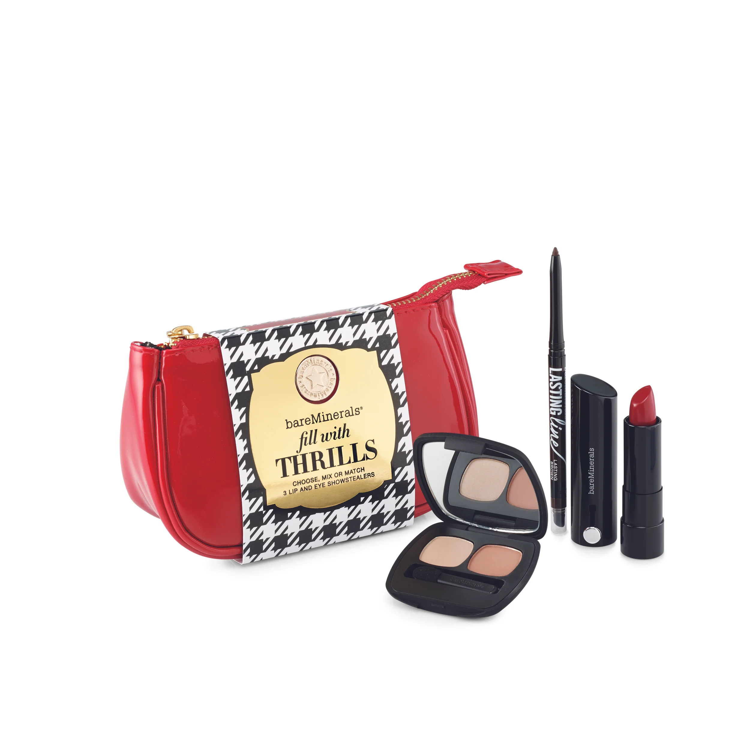
This was a fun shoot. For this project I did the creative direction, including the concept and shot list. Adorable packaging was done by the agency Mrs. and Mr. I gotta say, I had a lot of cuteness to work with! The amazing photographer Chris Andre has a great eye, which always ensures an amazing final product. These shots were to be used on social, web and print collateral. Yay team!
[WARNING: MORE GOOD STUFF AS YOU SCROLL DOWN]
Creative Direction, overall concept for campaign
Design Team: Meghan Phillips Bracamonte (Packaging), Erin Anderson (web), Lindsey Meyer (In-Store), Jenay Valencia
[WARNING: MORE GOOD STUFF AS YOU SCROLL DOWN]
Creative Direction and Design: Look and Feel applied to landing page as part of fuller campaign
Design Team: Lindsey Meyer, Jenay Valencia
[WARNING: MORE GOOD STUFF AS YOU SCROLL DOWN]
Creative Direction & Design
Welcome to our brand guide, where we lay out our core beliefs and foundational guidelines. As a member of the H2O+ Beauty family you are probably already familiar with this content, but it’s always nice to have a cheat sheet. We’ve also included tools to help maintain consistency in how our brand is communicated
and how our partners should represent us. So dive on in!
[WARNING: MORE GOOD STUFF AS YOU SCROLL DOWN]
Creative Direction: Campaign concept, Photoshoot
H2O+ DISCOVERY
MOVE BEYOND YOUR COMFORT ZONE
Seize the freedom to choose your own path, take chances, and define adventure for yourself. What you discover will shape your perspective and sharpen your focus. When you’re on the move you want skin care that can multitask and body care that can keep up the pace.
Scroll down for more images.
[WARNING: MORE GOOD STUFF AS YOU SCROLL DOWN]
Creative Direction: Photoshoot
Creative Direction: Photoshoot
Concept and Design: Packaging
Creative Direction: Website Landing Pages (Designer: Erin Anderson)
Scroll down for more images.
[WARNING: MORE GOOD STUFF AS YOU SCROLL DOWN]
Art Direction: Theme, Primary and Secondary Packaging, Supporting Collateral
Scroll down for more images.
Art Direction: Theme, Primary and Secondary Packaging, Supporting Collateral
Designer: Meghan Bracamonte
Art Direction: Theme, Primary and Secondary Packaging, Supporting Collateral
Designer: Kevin Wu
Art Direction: Primary and Secondary Packaging
Designer: Jaclyn Cotto
[WARNING: MORE GOOD STUFF AS YOU SCROLL DOWN]
Art Direction: Theme, Primary and Secondary Packaging, Supporting Collateral
Design Team: Kevin Wu, Ania Ivanova, Meghan Phillips, Jaclyn Cotto
Illustrator: Sarah Jane Coleman
Art Direction: Theme, Primary and Secondary Packaging, Supporting Collateral
Design Team: Kevin Wu, Ania Ivanova, Caroline Qvale, Lauren Golik
Lead Designer, component, box and supporting collateral.
This was one of my favorite projects. I had the opportunity to work directly with the Vice President of Creative and CMO of Bare Escentuals to design a brand new product line. It was the first time that bareMinerals was launching a pressed product, so the desire was to have clean, sleek and branded packaging to support it.Graphic Designer, photo direction
I was lucky enough to travel to New York for this photo shoot. It was a tremendous learning opportunity for me to shadow the Art Director and advise on multiple shots. This gave me the training I needed to then lead my own photo shoots in the future.
Graphic Designer, photo direction
Lead Designer, component, box and supporting collateral.
bareMinerals wanted a more natural look and feel for this launch. We decided to use a woodcut image for a hand done feeling.
Lead Designer, box and supporting collateral.
MD Formulations requested a face lift for their best selling kits. I used color coding for different skin types and very clear numbers to communicate the steps of the regimen. This was sold internationally, specifically in Europe, so I was sure to abide to global packaging requirements.Lead Designer, component, box and supporting collateral.
This was an exciting opportunity to streamline the look and feel and communicate the bronzing results of this product, while making it brand appropriate for bareMinerals.
Lead Designer, box
An exciting collaboration with Pretty Amazing and Virgin Atlantic. I worked directly with Virgin America's brand guidelines to create a look and feel that reflected both brands. This was sold in Virgin America boutiques and catalogs internationally.
Lead Designer, component, box and supporting collateral
Lead Designer, new line of components, boxes and supporting collateral
On this project, I had the chance to work directly with the Art Director, Vice President of Creative and CMO of Bare Escentuals to rebrand and redesign all components, boxes and supporting collateral for bareMinerals Skincare. I created a brand book, strict style guidelines for the supporting teams, and drove the consistency of the skincare line throughout the entire company. I then advised on how to apply the new look and feel internationally, taking into consideration global packaging guidelines.
Lead Designer, photo direction
Lead Designer, new line of components, boxes and supporting collateral
As part of the bareMinerals skincare re-brand, it was important to communicate this exciting event with the press. I created a press book leveraging the crisp and clean photography, and explaining the natural approach to skincare that bareMinerals is known so well for.
Lead Designer, boxes
Holiday is always a huge initiative in the retail environment. This was my contribution to Holiday packaging for 2012.
Lead Designer, component, box and supporting collateral.
7 Day Skin Detox is a very intense skin peeling system. This sect of skincare required a more modern and clean approach. By using large numbers on each bottle, it's very clear which is to be used on each day, while communicating how serious this product is.
Lead Designer, component, box and supporting collateral.
Everyone needs a good lip balm... so I designed the packaging to appeal to any gender.
Art Director, logo, branding collateral
This logo was for a new spa in Burlingame. The owner was inspired by the healing qualities of the lotus flower, so I used that as inspiration for the brand.
Art Director, logo, branding collateral
Custom candle design and scent for the grand opening.